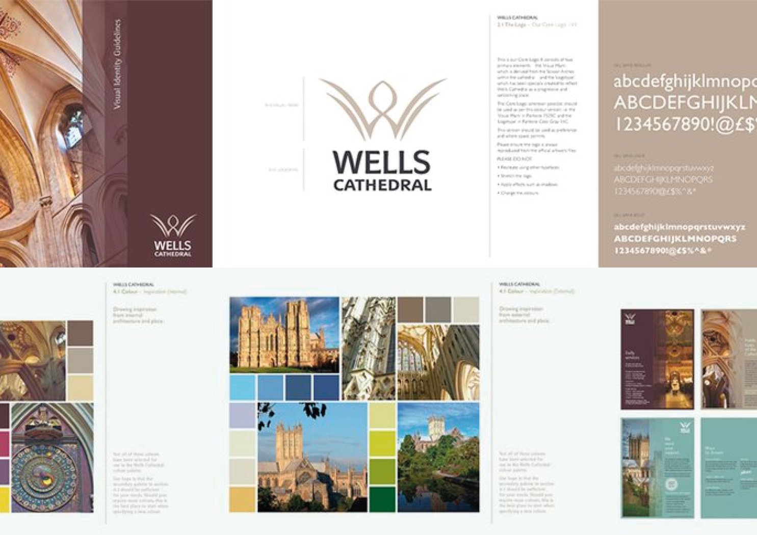
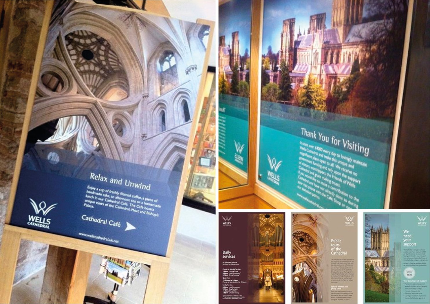
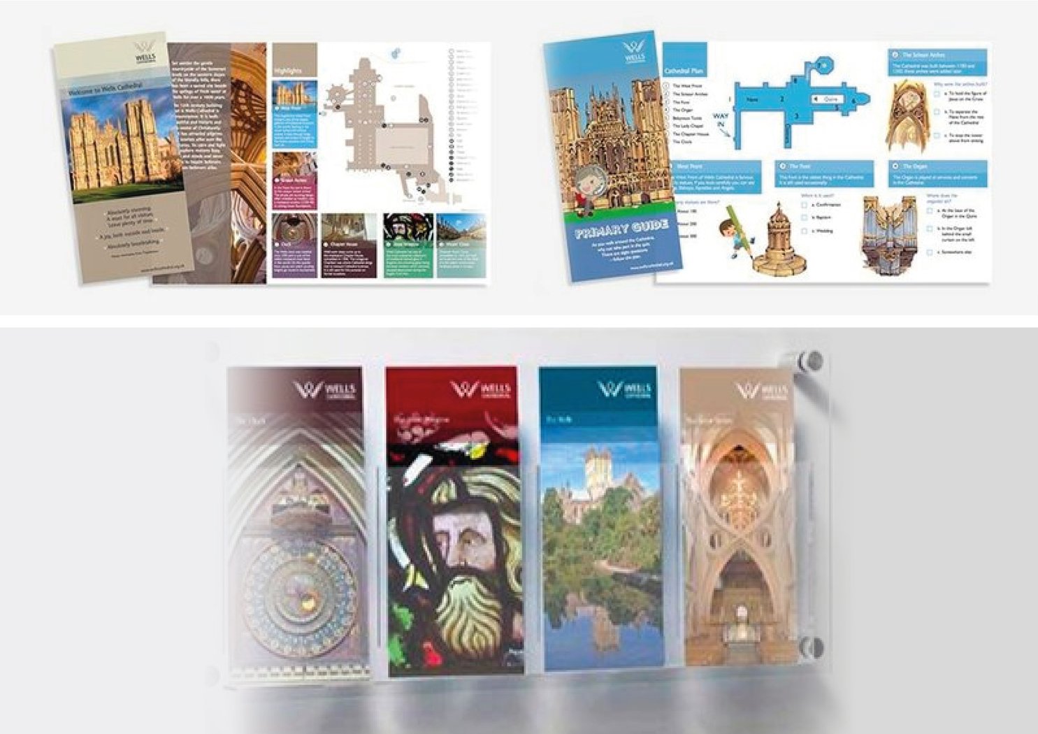
The mark picks up on the very human and welcoming spirit of Wells, with a nod to its sacred springs and a play on its unique scissor arch. The colour palette was inspired by the earthy stone colours of the building, and the beautiful stained glass tones. The tone of voice was one that speaks to all people, no matter their background. Straightforward and easily understandable, removing any barriers to accessing information.


