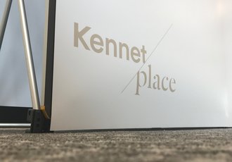
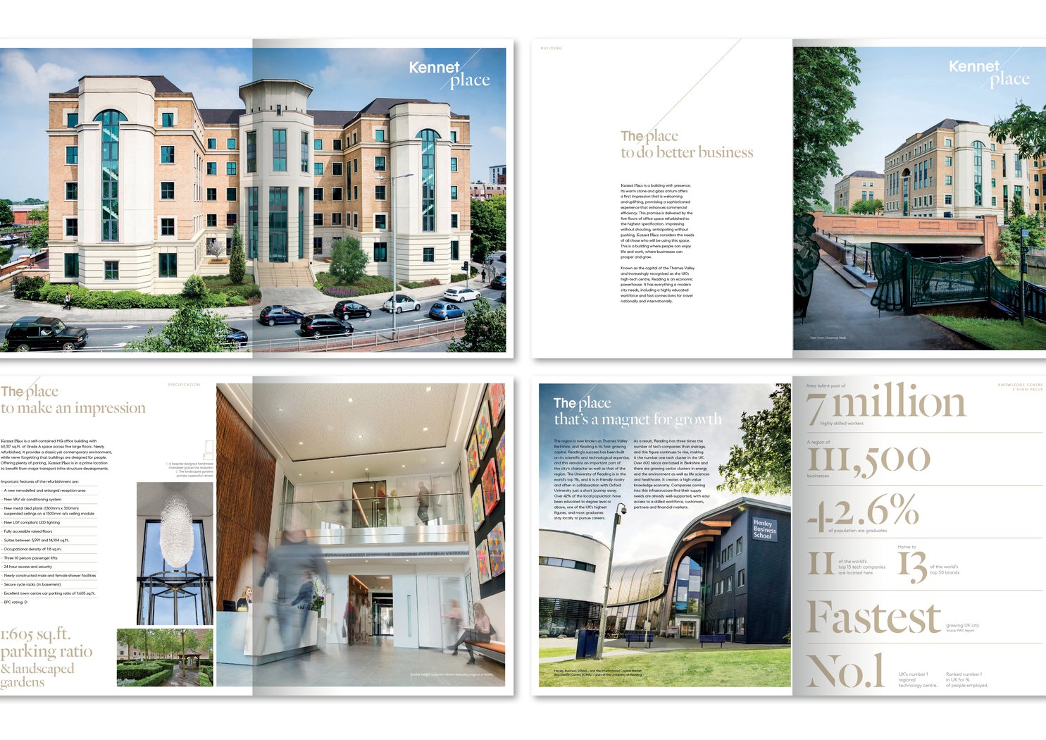
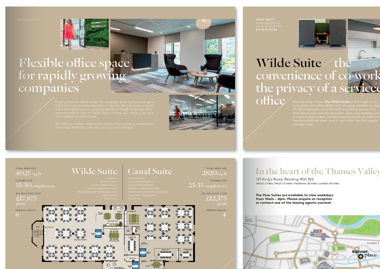
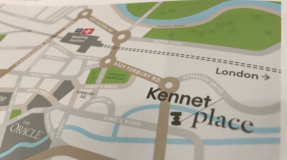
Brand identity, messaging, website design and marketing collateral for 'The Place to Work'
Brand identity, messaging, website design and marketing collateral for 'The Place to Work'
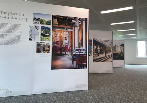
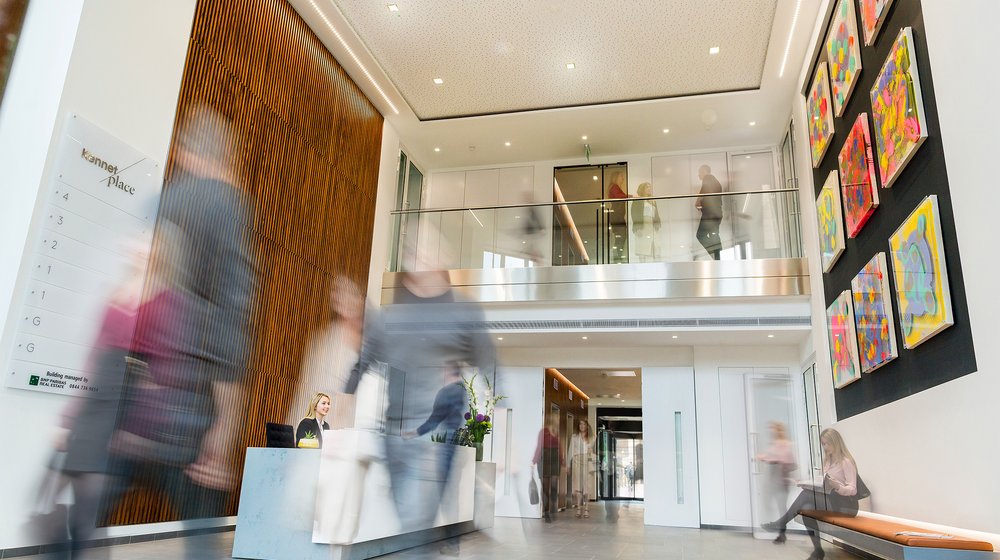
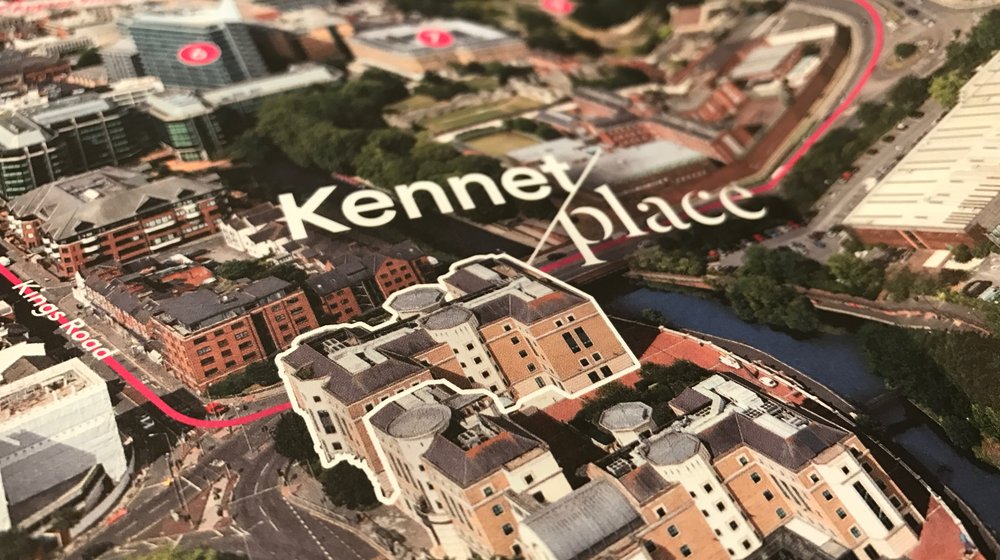
Photography & Art Direction
Brochures & Marketing Support Material
Website & Digital Marketing
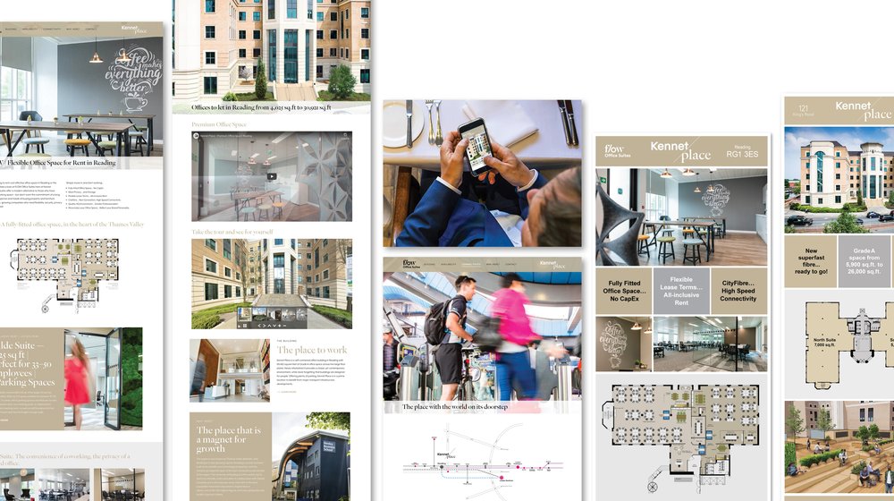
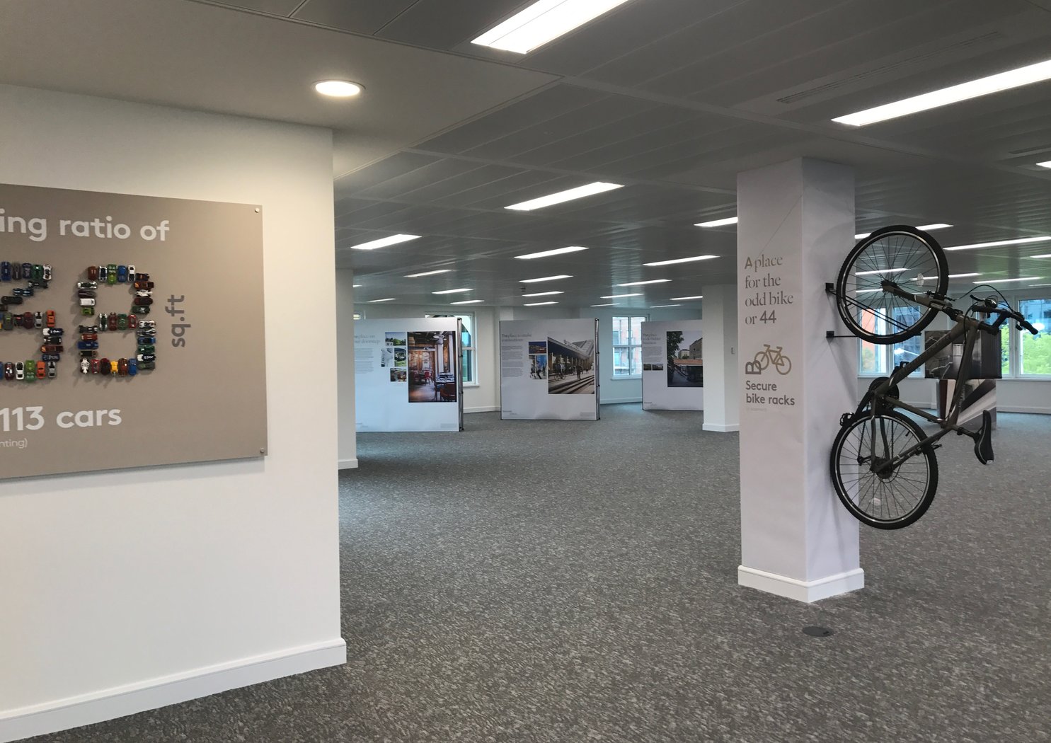
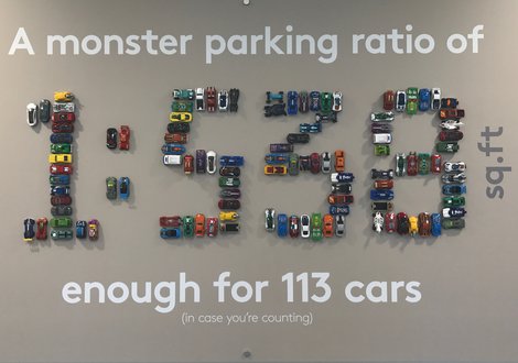
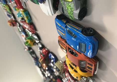
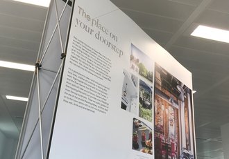
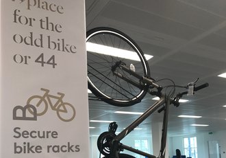
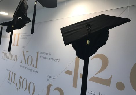
Marketing Suite & Sales Space