London’s Royal Docks - Positioning the destination as a new, unique place
London’s Royal Docks needed a brand to reflect its vision: To create a new, vibrant unique place for Londoners that embraces and uses the water as its core asset. There had been 72 masterplans over the years all thwarted by the sheer scale of these vast docklands. The site itself was neglected, the infrastructure in a poor state of repair and the companies there had more or less turned their back on the water. Our challenge was to humanise the Docks and identify a destination character for each area.
Insight: We researched how to position the Docks in the minds of Londoners, developers, investors, the marine community etc. We also looked to neighbouring Canary Wharf for comparison as our offer was geographically close but needed to be very different.
Imagine: It became clear that our brand had to position Royal Docks at the heart of London. It had to be human - a place for people. Give a sense of opportunity. Not dwell on the history which was about poverty and exploitation.
Our thinking was, that if Canary Wharf is where people come to work, London’s Royal Docks is the place where people ‘come to life’.
As a brand essence it has dual meaning. Firstly it’s the promise of the Royal Docks themselves coming to life, animating, sparkling, re-inventing for a new generation. Secondly, it was a glittering siren call, enticing people to visit, escape from the stale world of work, a place to excite and delight the senses, a place you can slow it down, socialise, unwind, disconnect and enjoy a greater depth of life, culture, experience.
Impact: It was obvious that the job of the brand was to attract pioneering, entrepreneurial types to the docks. Water does attract but places come to life through the people who are drawn to them. Those who see the possibility. So it was essential our brand reflected the water and helped bring the vision to life so others could see the potential.
As well as a brand identity complete with guidelines, we created signage and uniforms to herald the new branding at ground level to the super yachts berthing at London’s Royal Docks. A responsive designed website featured an easy to use CMS for the Royal Docks Management Team to update with news and events as well as enabling mobile device users to discover London’s exciting new destination on the rise.
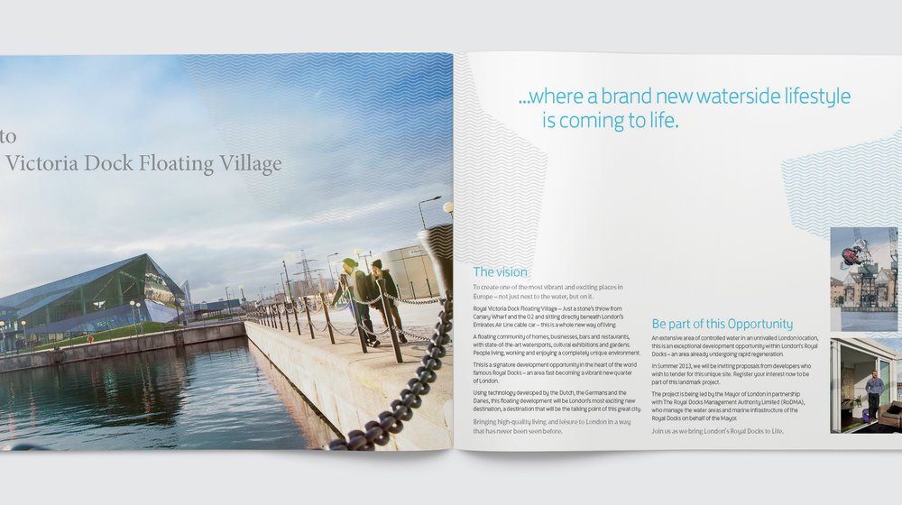
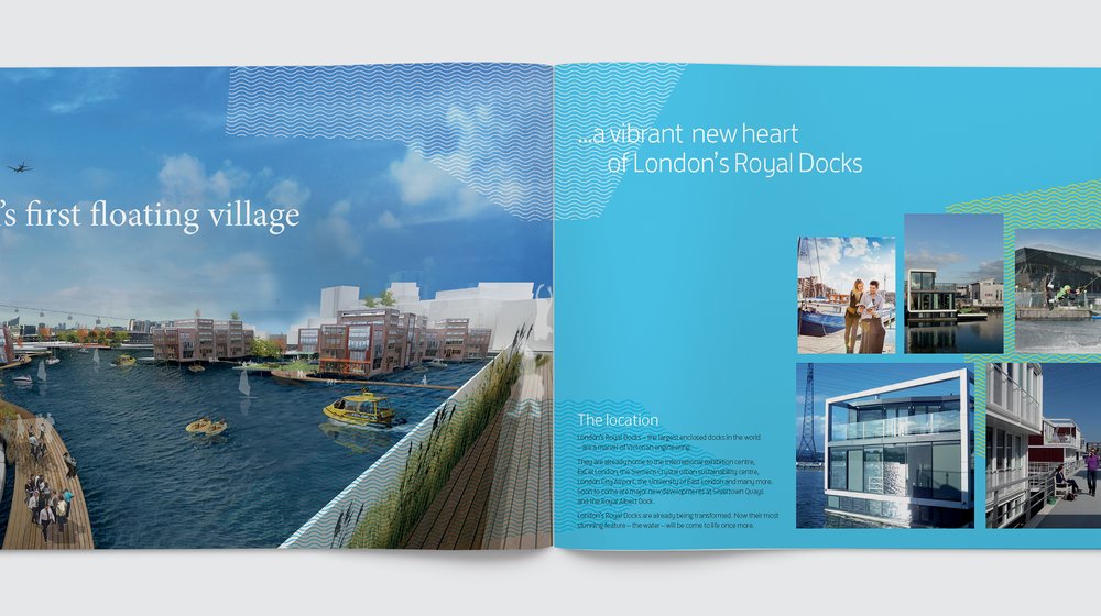
It was the start of a 20 year development plan and the big picture was to create London’s own 21st Century style ‘Venice’. A place that brings the water to life in myriad ways, that is home for creative industries, has floating studios and hotels, the UK's first floating residential developments and a range of floating entertainment including bars, stages, restaurants and leisure facilities.
Mike Luddy, Managing Director at Royal Docks Management Authority said: "Voyage helped us with the creation of a new brand strategy and branding for London's Royal Docks. As usual, Jules and her team applied considerable creative flair and thinking to this project and produced excellent results. I recommend Voyage to anyone looking to revitalise their brand strategy."